 Open full size ↗
Data Visualization
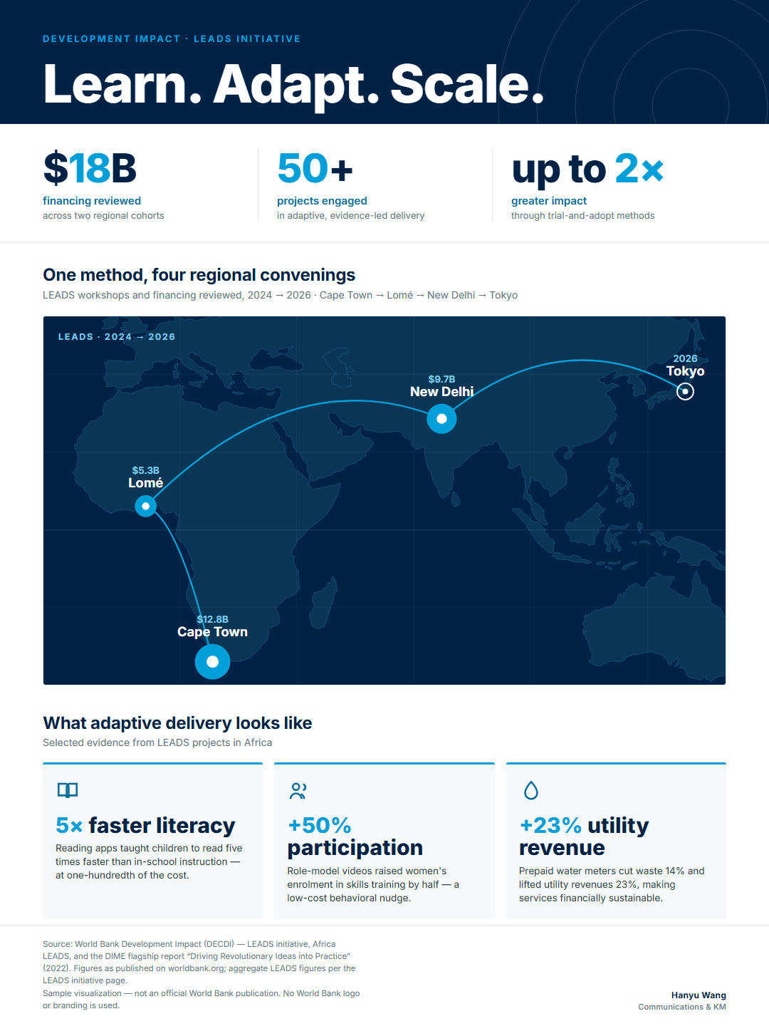
LEADS Impact, at a Glance
An infographic distilling $18B in financing reviewed and the Learn–Adapt–Scale method into a single 20-second read, in the visual language of a flagship report.
Communications & Knowledge Management
I turn complex research and data into content that reaches people — across digital, visual, and multilingual channels. Four years doing this at Xinhua, in international development, and in my own work.
This page is a working application for the Knowledge Management & Communications Consultant role at the Development Impact Group (DECDI). It begins with a sample communications set built from DECDI's own LEADS initiative — the kind of products I'd produce week to week — followed by selected work that demonstrates reach, multilingual dissemination, and craft in data visualization.
Below: a sample of what I'd produce for your team, and selected work.
Washington, DC · Available immediately · EN / ZH / ES
Made for your team
Built from DECDI's own LEADS initiative — the kind of products I'd produce week to week. It starts with a live, interactive piece — then the full set of designed assets.
Interactive · Live
In two years LEADS went from one African region to four convenings across three continents. Hover the map to read each workshop — every figure is drawn from the World Bank's own LEADS pages.
The full set · download-ready
Open full size ↗An infographic distilling $18B in financing reviewed and the Learn–Adapt–Scale method into a single 20-second read, in the visual language of a flagship report.
 Open full size ↗
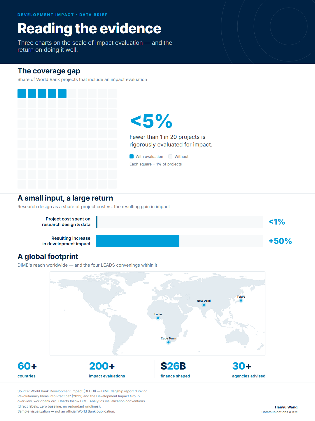
A report-style chart sheet — a coverage-gap waffle, a cost-vs-impact comparison, and DIME's global footprint — built to DIME Analytics' visualization conventions.
Evidence only matters when it changes what happens on the ground. That's the idea behind LEADS — Learn. Adapt. Scale.
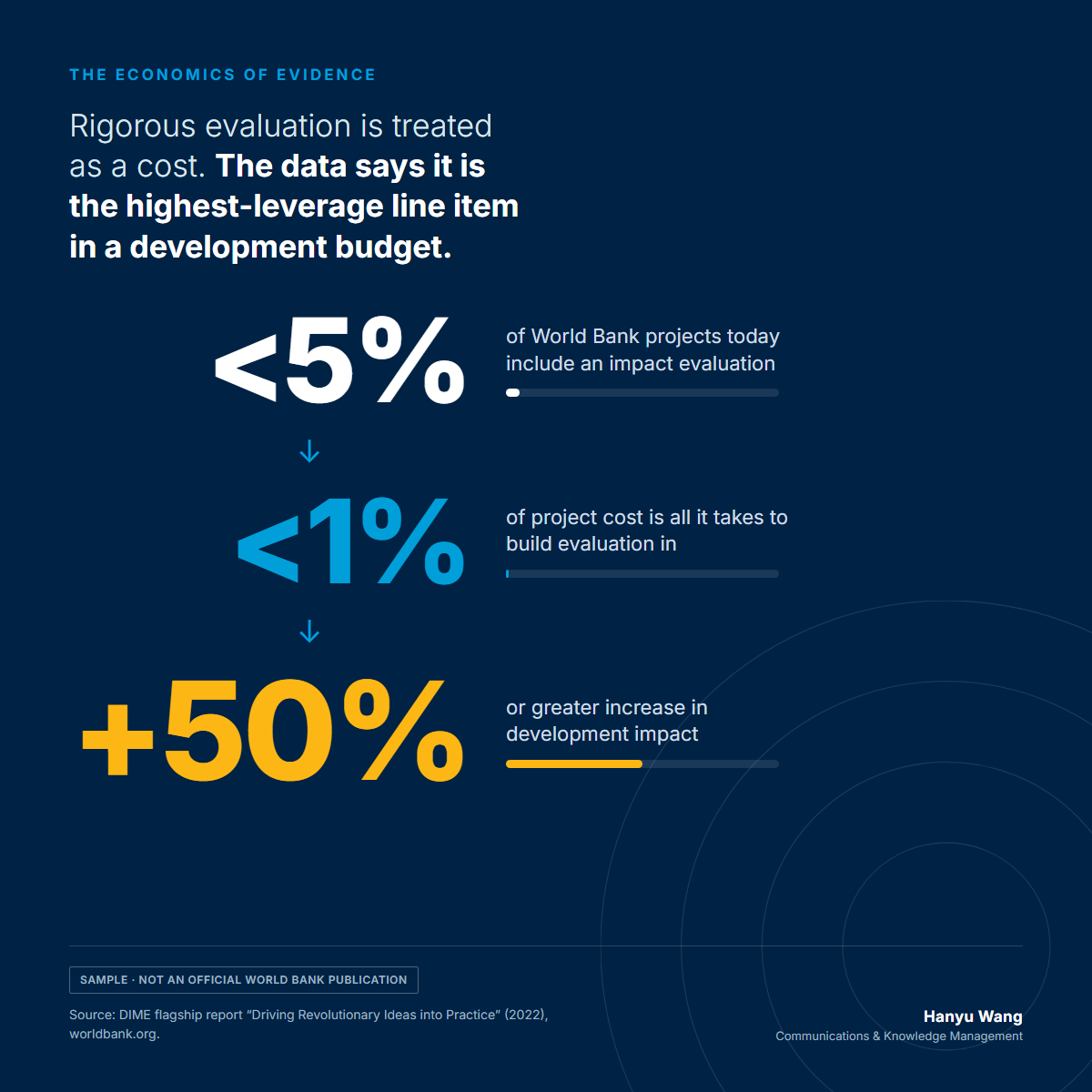
A scroll-stopping post turning three flagship-report numbers into one argument — shown as it would land in-feed.
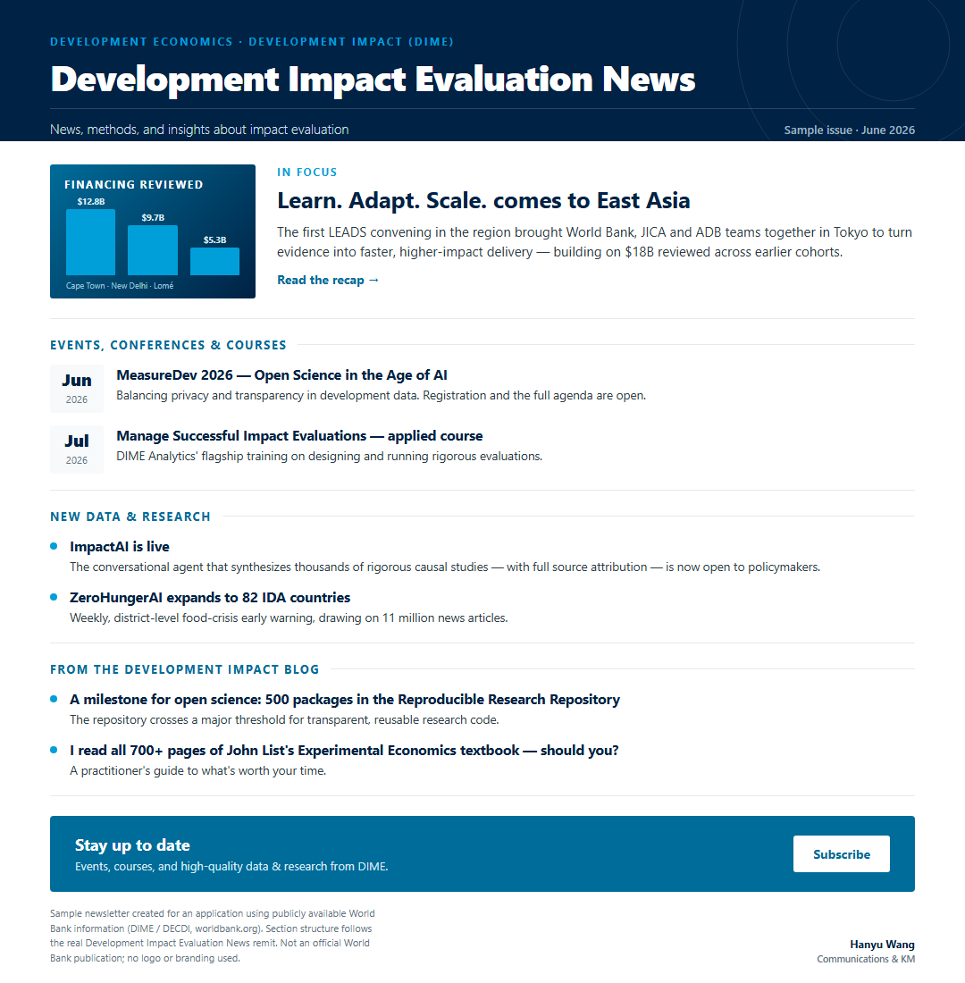
A sample issue built to the newsletter's real remit — lead story, events & courses, new research, from the blog — shown in the inbox.
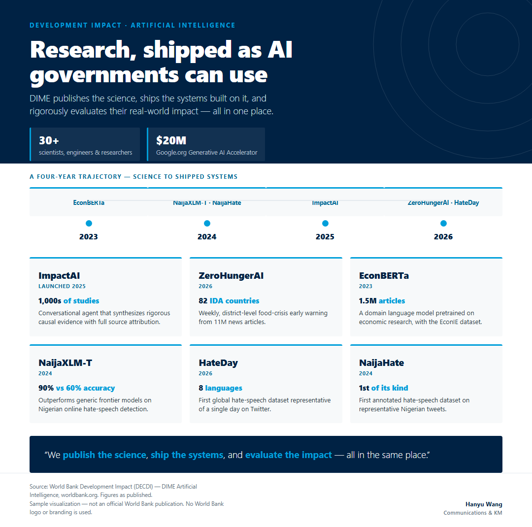
A product-grid infographic on DIME's AI portfolio — ImpactAI, ZeroHungerAI, EconBERTa and more — showing how a 30+ person team turns rigorous research into systems that governments use.
Sample work created for this application using publicly available World Bank data. Not official World Bank publications.
How this was made
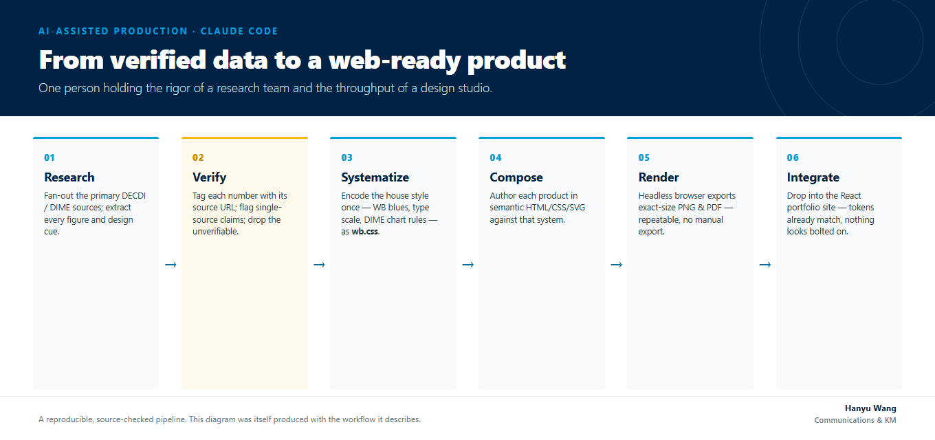
Every sample above came out of a documented, source-checked pipeline — and I can work in either of two toolchains, depending on the product.
Workflow 1 — Traditional
Publication-ready statistical charts in DIME Analytics' own stack — direct labels, zero baselines, no chart junk. Reproducible and rigorous.
Workflow 2 — AI-assisted
Composed infographics, social cards, and newsletters — web-native, on-brand, and fast, with every figure traced to a public World Bank source.
Both workflows — with runnable code and full data provenance — are published on GitHub ↗.
Selected work
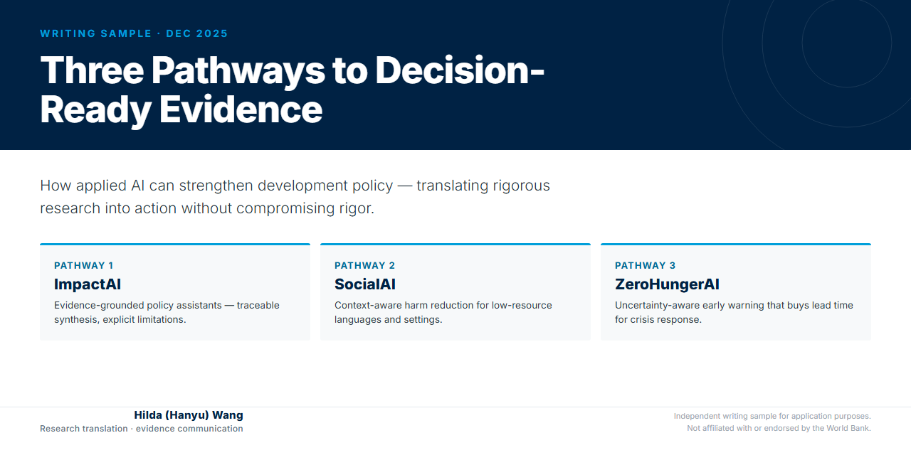
An independent writing sample translating DIME's AI portfolio — ImpactAI, SocialAI, ZeroHungerAI — into a clear, decision-focused brief on getting evidence to policymakers without losing rigor.
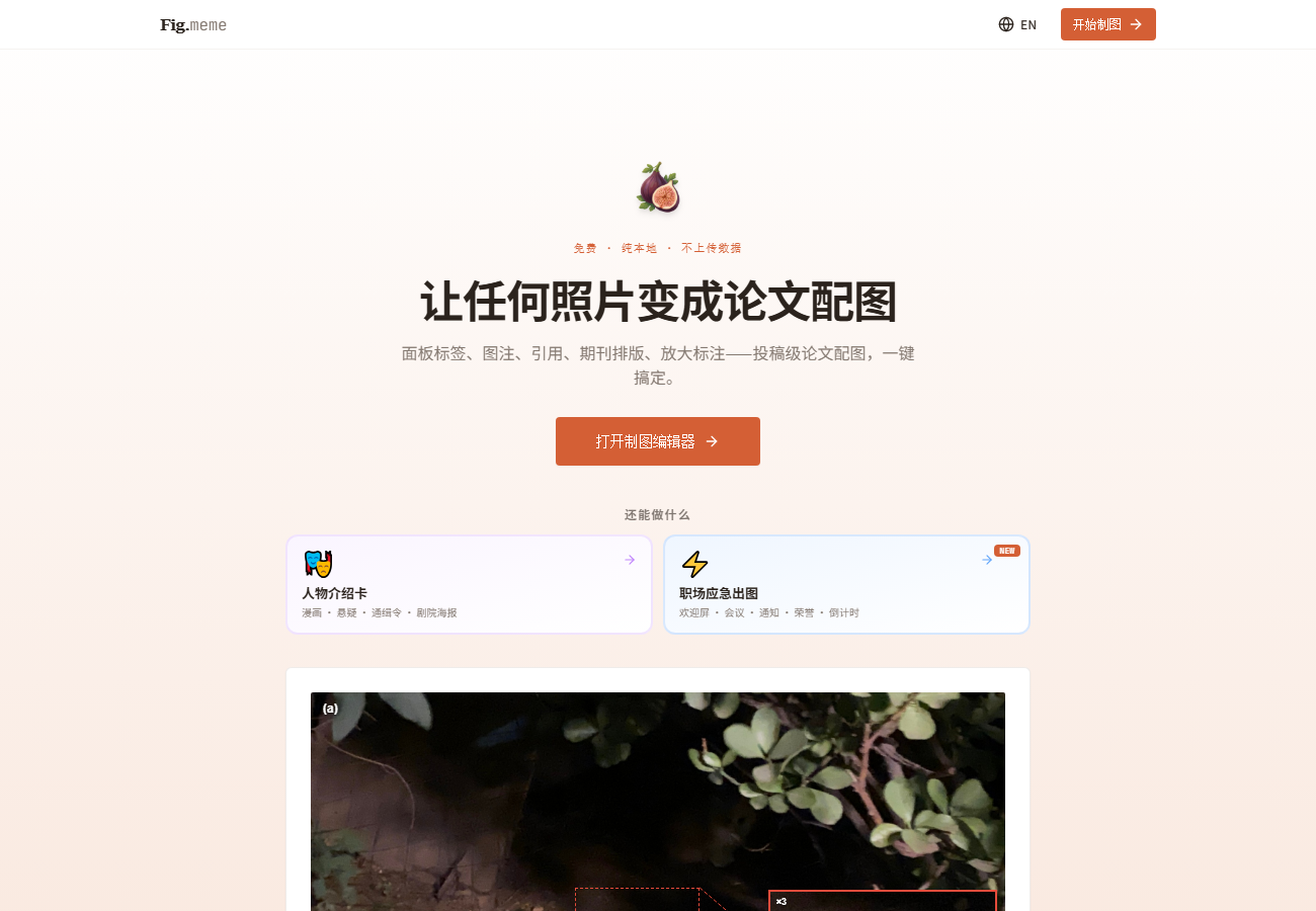
A content tool I designed and shipped reached 30,000+ engagements in a single day through deliberate audience targeting and bilingual (EN/ZH) framing.
figmeme.app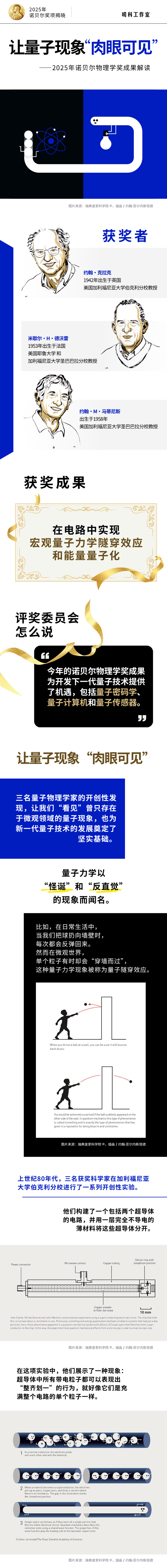
A long-form explainer infographic I designed for Xinhua's Global Digital Desk on the 2025 Nobel Prize in Physics — turning a dense quantum result into a scrollable visual story for a general audience. Part of my ongoing “Science, Explained” (唠科) infographic series, published nationally.
What I bring
Built end-to-end
At AI4Life I designed and built the Vibo education platform end to end — the brand and character system, the original music, the game mechanics, and the website itself — and ran the communications for our flagship youth program.

Vibo · AI education platform
I created the mascot and full character set, composed the original music, designed the game mechanics, and built the web platform — including an AI mini-game for children with special needs in Boston.
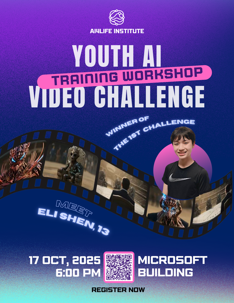
Event communications
I ran end-to-end communications across two cohorts — recruitment, this poster and the promotional content, training-workshop production, judge coordination, and hosting the live awards ceremony. 50+ participants.
Application materials
The short version is here; the full documents are a click away.
Curriculum Vitae
EN · PDFCommunications & Knowledge Management · Washington, DC
Statement of Interest
EN · PDF“DECDI closes the gap between intention and impact. My work has been the same bridge from the communications side — turning rigorous research into content that reaches the people who act on it, across languages and channels.”
The full statement connects three threads: multilingual research dissemination, fluency with the research itself, and end-to-end production of audience-ready knowledge products.
Read full statementFull CV and statement of interest available on request.